|
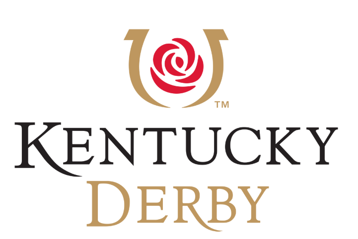
Being Kentucky born and bred, I know there is a lot of "luck" in horse racing. The Kentucky Derby official logo is nearly perfect. The classic font (Goudy Oldstyle) with beautiful letter spacing and a touch of custom lettering embellishments is a rare delight to behold for a seasoned designer like me. A simple clean line, colors, and icon to fit every situation from print to social media. The horseshoe image fits so nicely around the iconic, traditional rose. Why is the horseshoe image one to develop all the branding around? It is lucky. The horseshoe IS a perfect icon for the Kentucky Derby.
It is a common legend that the horseshoe is a symbol of GOOD luck. Like most designers should do when designing a logo, I did a little research on the background of the horseshoe. One article from People describes several stories. "The devil needed new shoes...witches are afraid of iron horseshoes...seven holes in a horseshoe is lucky." The one I know and have heard the most? "Hanging a horseshoe heels up means it keeps all the good luck from running out of the shoe." Any and all of these things mean a lot to a race based on equal parts skill and chance. But just like all superstitions, the horseshoe can also become unlucky. So why did this designer choose to ignore this urban legend? I am sure people of the area have been scratching their heads since it's launch in 2009. Did the luck of this horseshoe--designed to be a symbol of good luck--become UN-lucky? After this year's horse deaths at Churchill Downs and the Derby race with a disqualified winner, it really makes you wonder! (145th race in 2019) This horseshoe has no holes. It is upside down--which is good to hold the luck in the horseshoe, however, it is broken at the bottom. To someone more superstitious than I am, that means all the luck has gone run out! A little research might have prevented a culture clash in this symbol. The thing about luck is that it is highly unstable. Either you have it or you don't! One person has it awhile and then it transfers to another. Research and facts are a bit different. Taking some time to look into the "why" of a symbol, culture of a business--or in this case, multi-billion dollar industry-- is never time wasted. Does your image look like something else? Lead a viewer away from your intent? Become "off color?" Become unreadable in certain circumstances? Or make people wonder if you know anything about your customer? That would be highly unfortunate--or you might say unlucky. To be fair to the designers out there, customers can, demand, redirect, and insist on changes that are not great design decisions-embarrassing at times. If that is the case, this designer was just out of luck! Comments are closed.
|
Sarah ThurstensonGraphic Designer with awesome clients, happy wife, mother of two with a thought about this and that, Sarah is also the owner and instructor for Something From Nothing Paint Parties-On location custom canvas painting parties. Archives
February 2020
Categories |
SARAH THURSTENSON DESIGN
|
PHONE |
|


 RSS Feed
